Sometimes after Categories or Portfolio items deleting you can get this error (White Screen or “Formatting error”)
This error says about NULL link which is stayed in the “Banner” shortcode after Categories or Portfolio items deleting.
Solution: go to the Front page, click on the banner shortcode and click “Save”

To make any changes to the theme files use a child theme, or when you update your changes to the theme files may be lost
Child Theme is included in the main archive
Child Themes documentation in WP codex
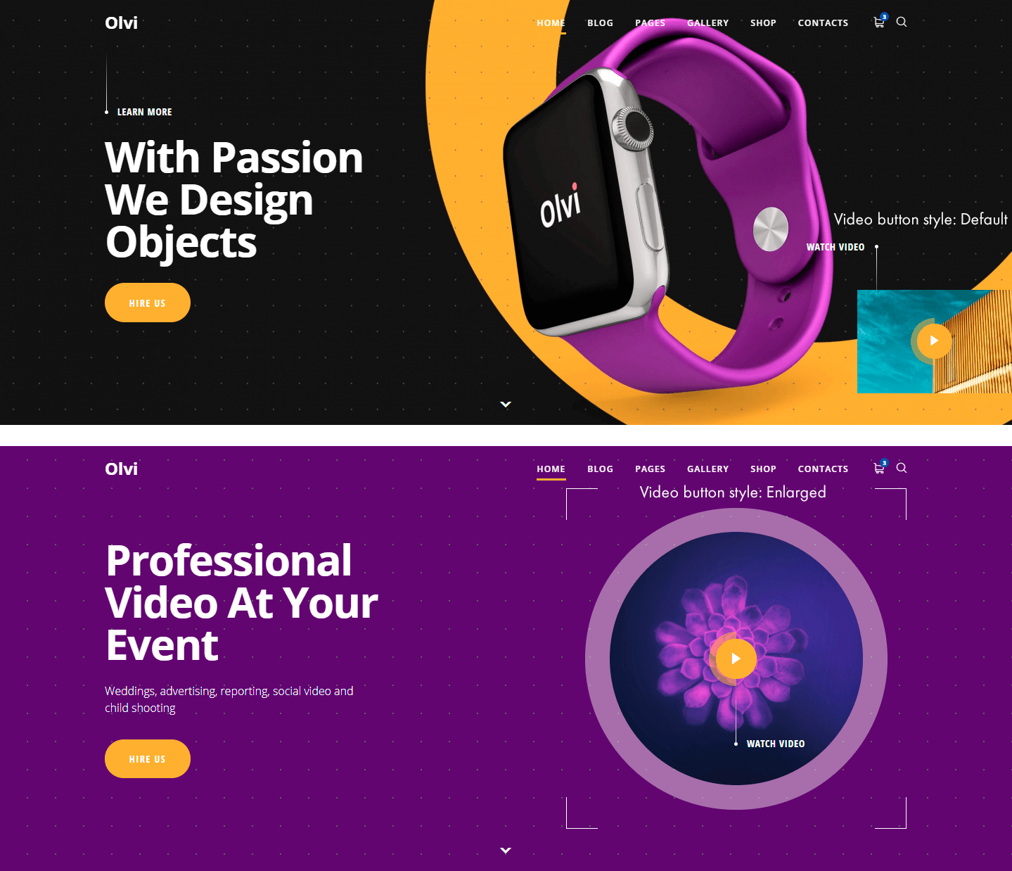
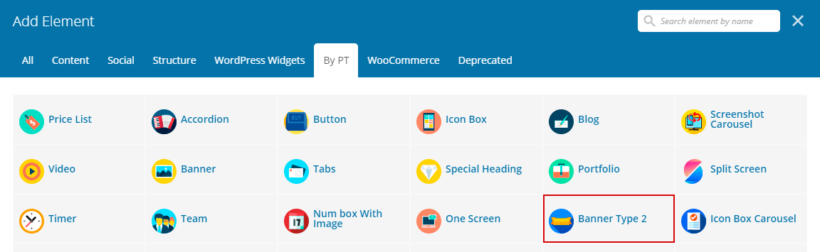
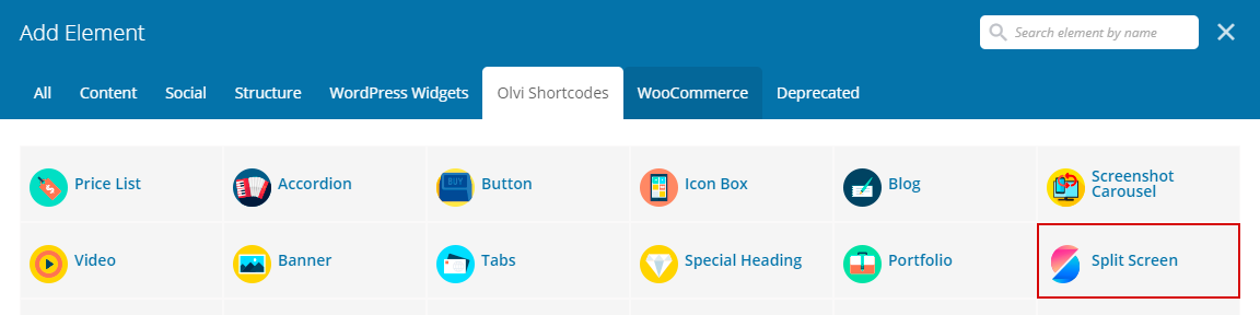
Banner Style
Style1
Style 2
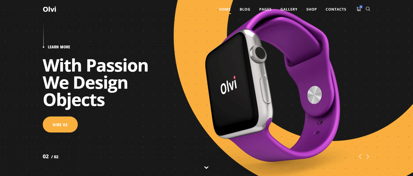
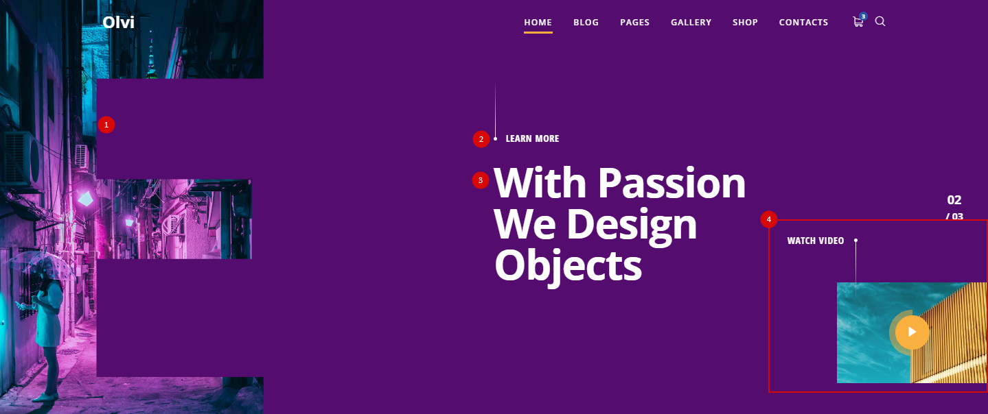
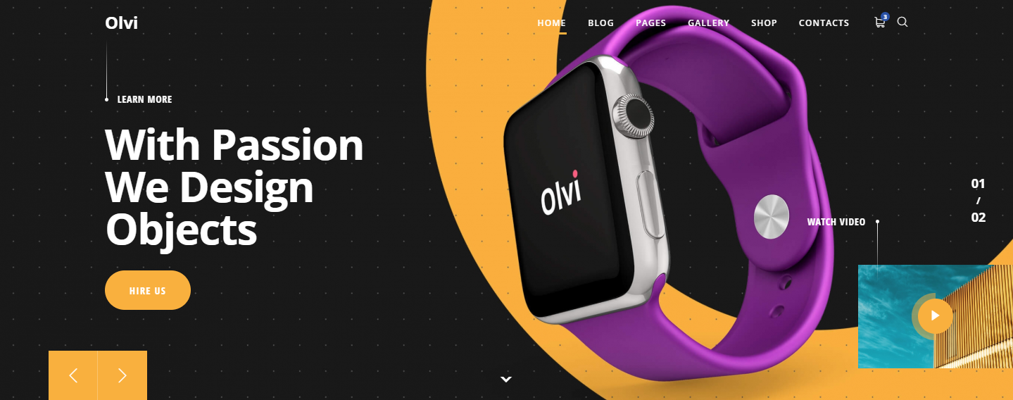
Arrow to next screen
Show or Hide arrow to next screen
Navigation
- Navigation – Show or Hide navigation arrows
- Slider Count – Show or Hide navigation arrows
General
Background type
- Image – Select image for background
- Gradient – Chose gradient colors
- Dots – Select backrgound color and dots color
- Color – Select background color
Background Video url
You can enter your video URL (YouTube, Vimeo, your own .mp4).
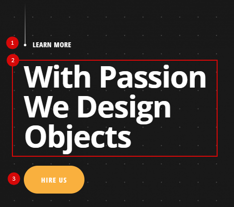
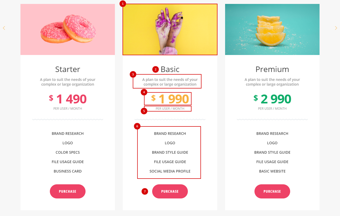
- Sub Heading – Type sub heading (#1)
- Heading – Type heading (#2)
- Text – Type your description
- Link – Type url and link text (#3)
- Link with icon – if you want add icon to link set “On”
- Icon position – Select icon position before or after
- Icon library – Select icon library
- Icon – Chose icon
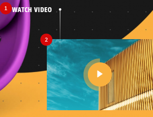
- Video button – Set “On” if you want display video block
- Video button style – Default or Enlarged
- Video Text – Type video label
- Video Url – Type video url
- Video Cover – Select video image
Design
- Color overlay – Overlays the selected color on the image. For example, using this option, you can darken the image so that the text is more readable.
- Item color – Select content color
- Text align – Select text align
- Vertical align – Select vertical align
- Background image position – Select background image position
- Heading font size – Type heading font size. Examples:
46px, 2.5em, 230% and more
- Sub Heading font size – Type Sub heading font size. Like Heading font size
- Text font size – Type text font size. Like Heading font size
- Button color – Choose button color
Settings
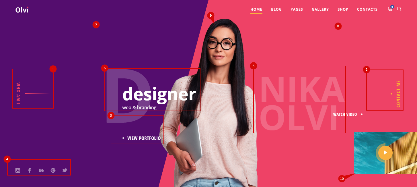
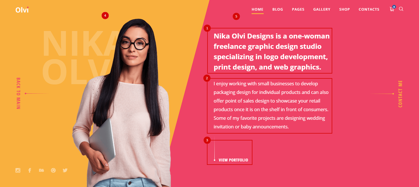
- About me – Show or hide about block (#1)
- Contact me – Show or hide contact me button (#2)
- Portfolio – Show or hide portfolio items (#3)
- Social buttons – Show or Hide social links (#4)
- Social buttons color – Chose social links color
Content
- Name – Set your name (#5)
- Profession – Your profession. (#6)
Example:
designer
{web & branding}
- Background color – Left block background color (#7)
- Background color 2 – Right block background color (#8)
- Your Personal Image – Choose your image (#9)
- Video button – Set “On” if you want display video block (#10)
- Video Text – Type video label
- Video Url – Type video url
- Video Cover – Select video image
Social Links
This option is responsible for displaying social icons. By default, links are taken from “Olvi Theme > Theme Options > Social buttons“, if you want to use unique links go to the tab “Social Links”.
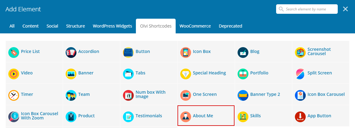
About Me
- Label – Set button label
- Type – Select Content or Custom link
- Background color – Left block background color (#4)
- Background color 2 – Right block background color (#5)
- Heading – Type Heading (#1)
- Text – Type Text (#2)
- Link – Type Link (#3)
Portfolio
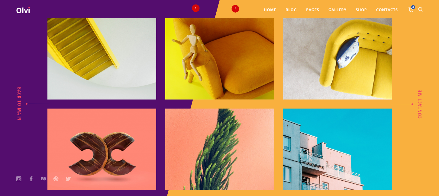
- Label – Set button label
- Type – Select Content or Custom link
- Cols – Set column number (min 1 – max 4)
- Rows – Set row number (min 1 – max 2)
- Background color – Left block background color (#1)
- Background color 2 – Right block background color (#2)
- Items – Select portfolio items
Contact
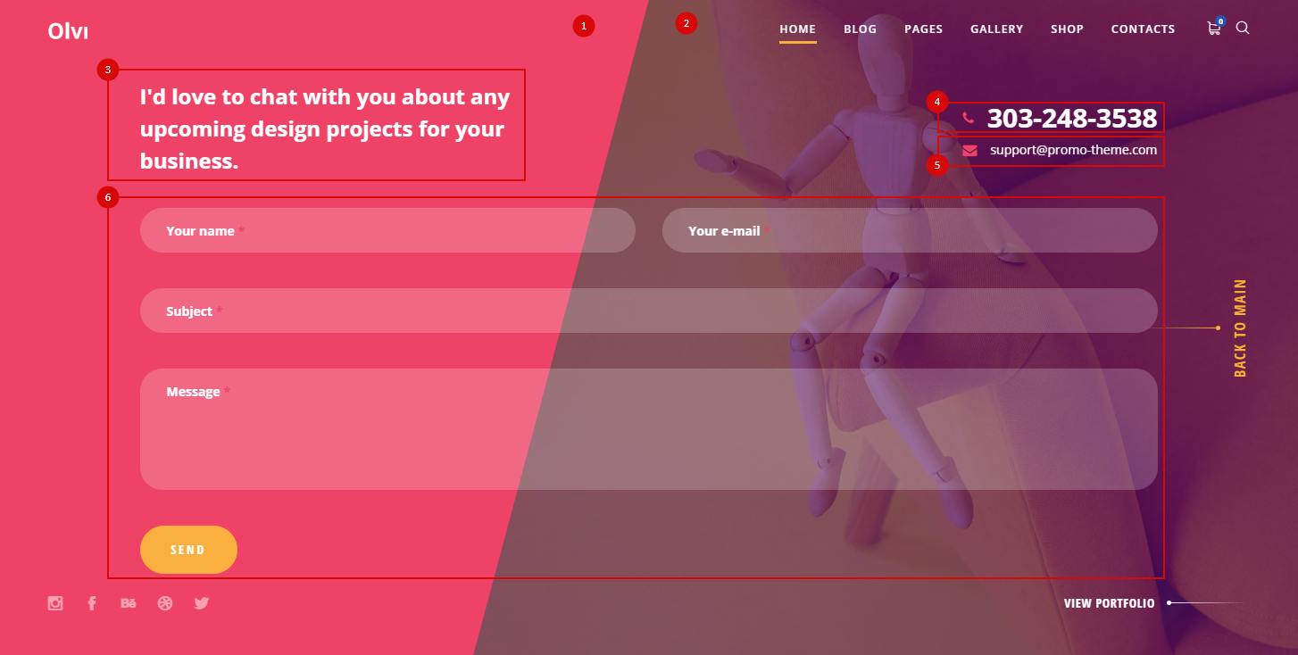
Contact form 1
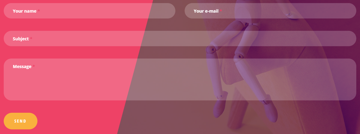
<div class="contact-form row"><div class="col-xs-12 col-sm-6">[text* f-name class:style1]<label>Your name <span>*</span></label></div><div class="col-xs-12 col-sm-6">[text* f-mail class:style1]<label>Your e-mail <span>*</span></label></div><div class="col-xs-12">[text* f-subject class:style1]<label>Subject <span>*</span></label></div><div class="col-xs-12">[textarea f-text class:style1 x6]<label>Message <span>*</span></label></div><div class="col-xs-12">[submit class:button-style1 "send"]</div></div>
Contact Form 2

<div class="contact-form-t2 row"><div class="col-xs-12">[text* f-name class:style1]<label>Your name <span>*</span></label></div><div class="col-xs-12">[text* f-mail class:style1]<label>Your e-mail <span>*</span></label></div><div class="col-xs-12">[textarea f-text class:style1 x6]<label>Message <span>*</span></label></div><div class="col-xs-12">[submit class:button-style1 "send"]</div></div>
Subscribe form
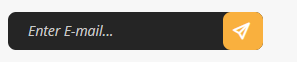
<div class="sub-form">[text* your-email class:input placeholder "Enter E-mail..." ]<button type="submit" class="wpcf7-form-control wpcf7-submit button-style1 base-icons-paper-plane"></button><span class="ajax-loader"></span></div>
Subscribe form 2
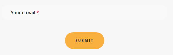
<div class="sub-form2">[text* your-email class:style1]<label>Your e-mail <span>*</span></label><button type="submit" class="wpcf7-form-control wpcf7-submit button-style1">submit</button></div>
Subscribe form 3

;span>*</span></label><button type="submit" class="wpcf7-form-control wpcf7-submit button-style1">submit</button></div>