This section of the User Guide provides a comprehenisve overview of all the settings available in the Theme Options section of your WordPress admin panel. The settings found here are applied globally and will affect all pages on your website.
General #
- Site color mode – set the base color of your theme for all pages
- Main Color – choose the main color of the theme
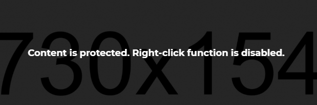
- Right click disable – is one of the methods you can use to deter casual theft and write your message, which will use in this way
- Protected Page Message – write your own protect message for your site
- Mobile Adaptation – sets the type of background images on mobile devices (original or cropped)
- Category Prefix – Hides the title prefix on the category page
- Lazyload Images – activates lazy loading images
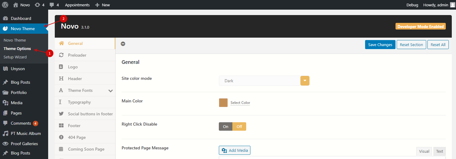
Right Click Disable #
If you want to protect your content from copying, you can prevent the right click.
To activate this option go Novo Theme > Theme Options > General > Right Click Disable – On
After activating this option, when clicking on the right button, the user will receive a message
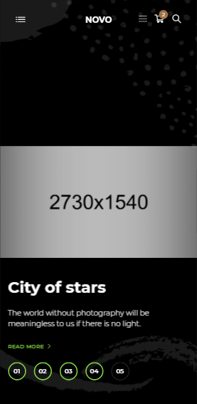
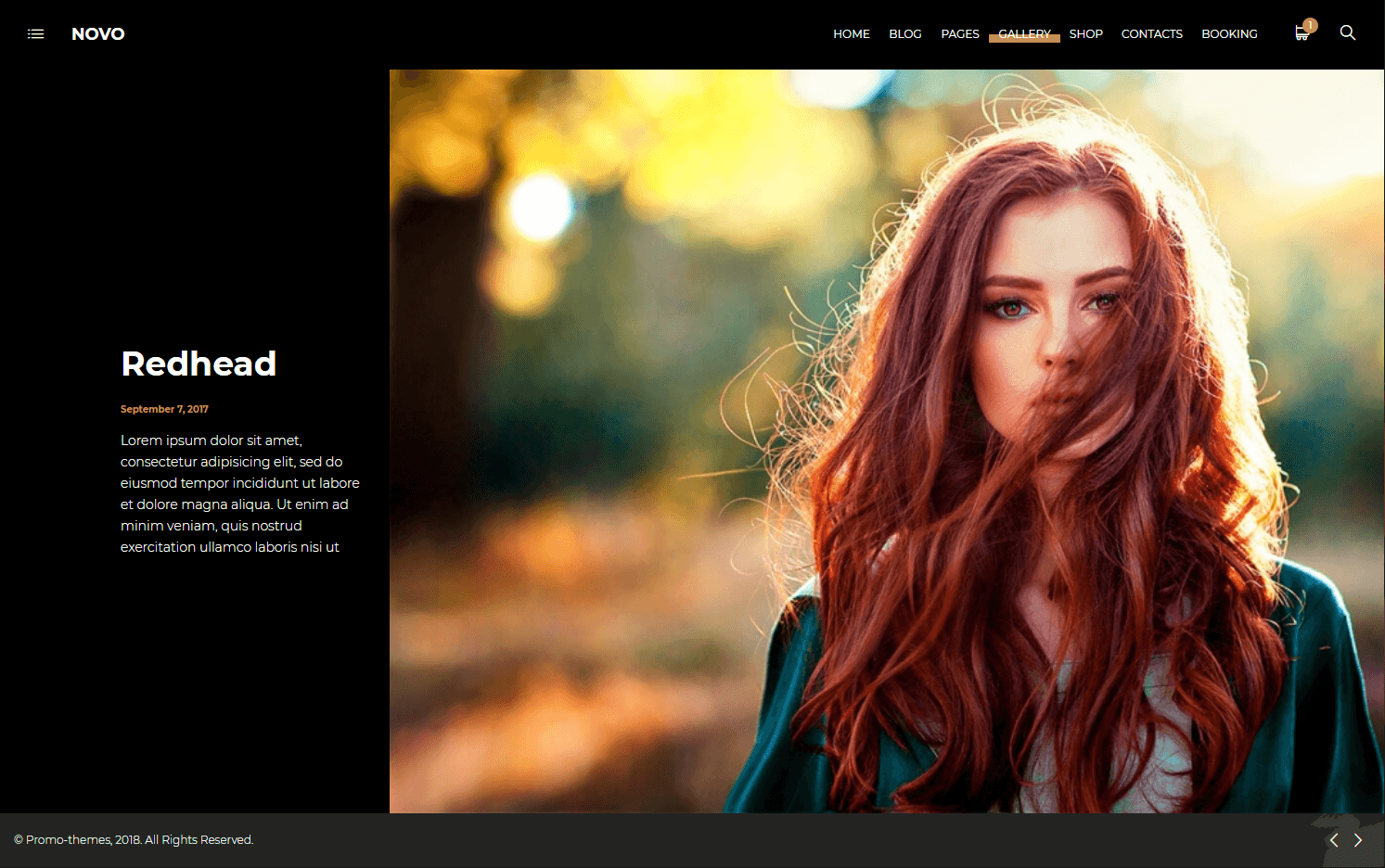
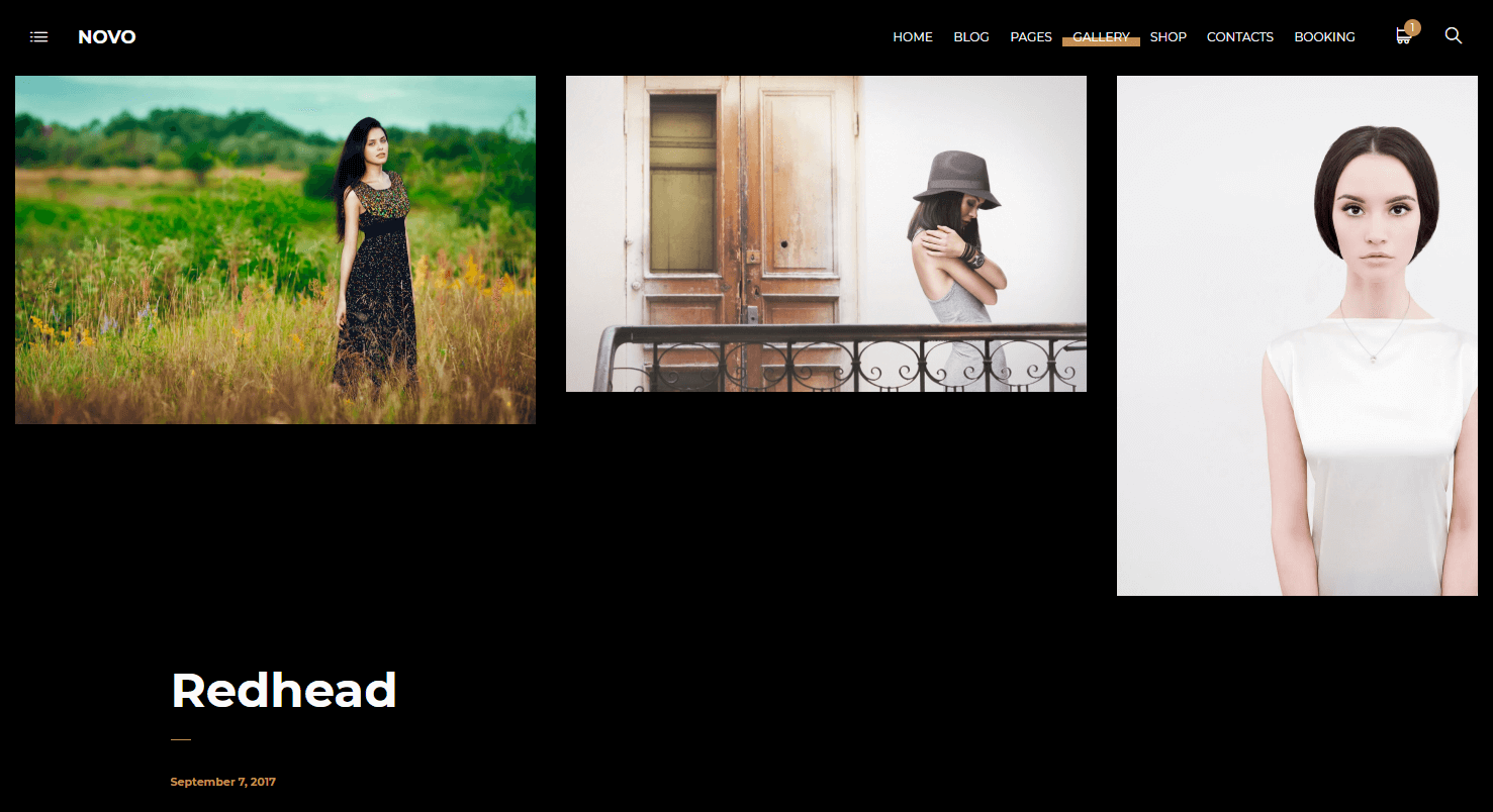
Mobile Adaptation #
With this option you can control the type of display of images on a mobile device.
Novo Theme > Theme Options > General > Mobile Adaptation – On
Examples:
Original
Cropped
- Original – Scales the image as large as possible without cropping or stretching the image.
- Copped – Scales the image as large as possible without stretching the image. If the proportions of the image differ from the element, it is cropped either vertically or horizontally so that no empty space remains.
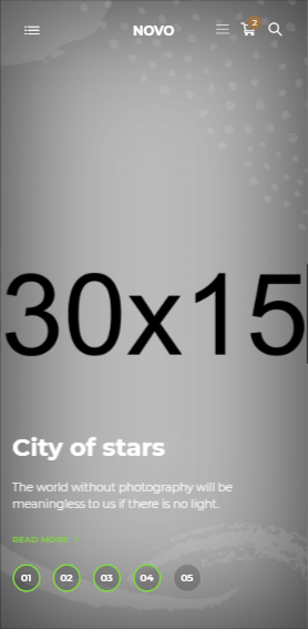
Preloader #
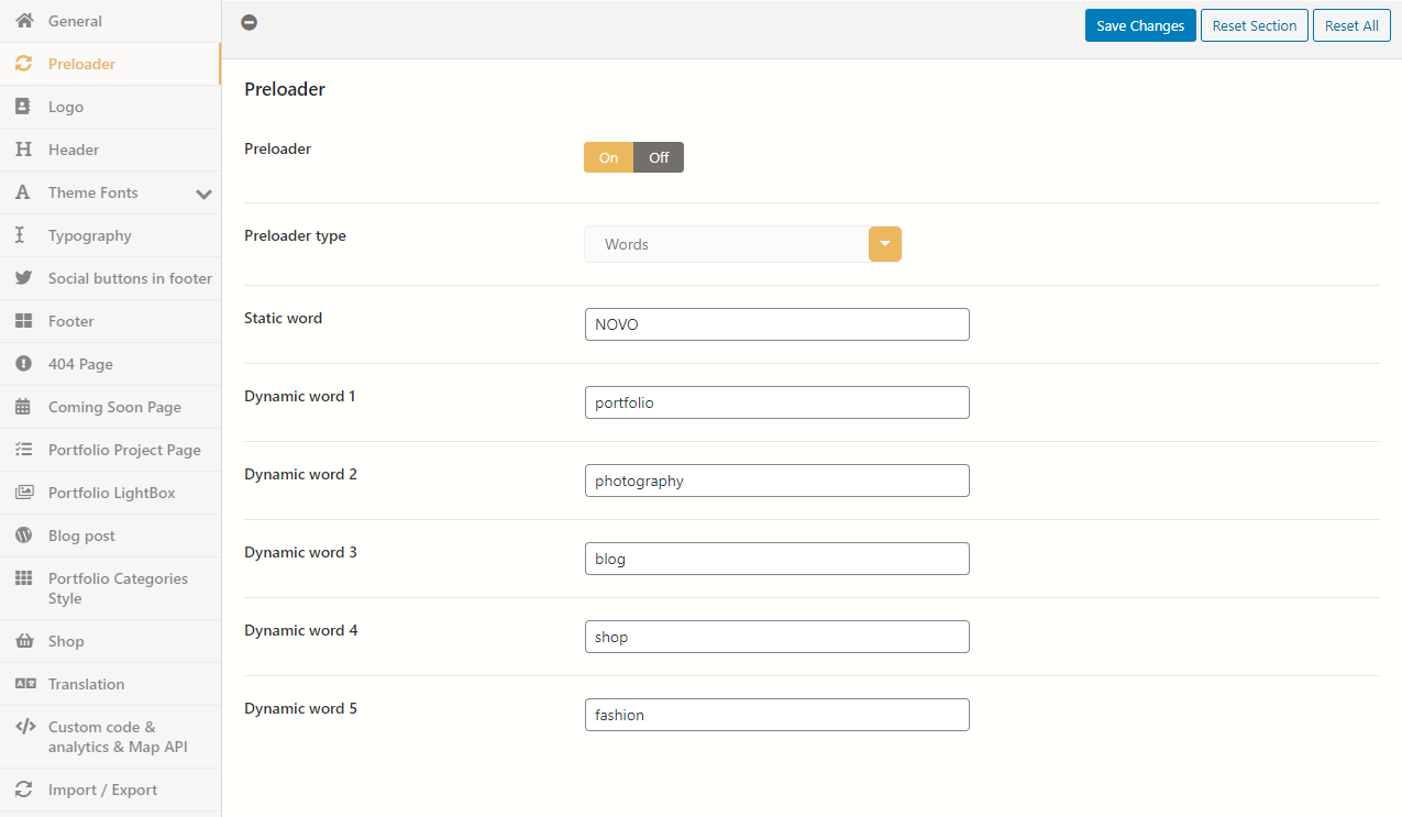
You can on/off this option. If this option is on, at first, choose Preloader type (words or image).
Then write static word and dinamic words for words type and choose a default logo image to display for image type.
Logo #
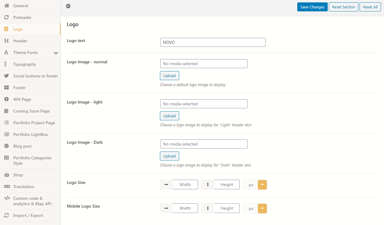
- Logo text – Set this option to “Yes” to hide the logo from your website.
- Logo Image – Normal – Upload a default logo for your website.
- Logo Image – Light – Upload a logo to be displayed on the “Light” header skin.
- Logo Image – Dark – Upload a logo to be displayed on the “Dark” header skin.
- Logo size – Set logo width and height.
- Mobile Logo size – Set mobile logo width and height.
Header #
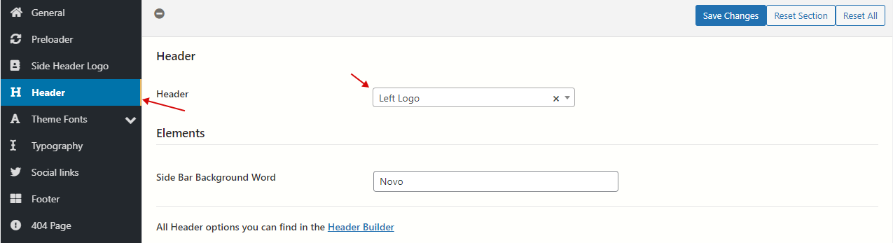
Header – You can type a header
Side Bar Background Word – Type words
Theme Fonts #
Fonts

Fonts – All installed fonts are displayed in this area.
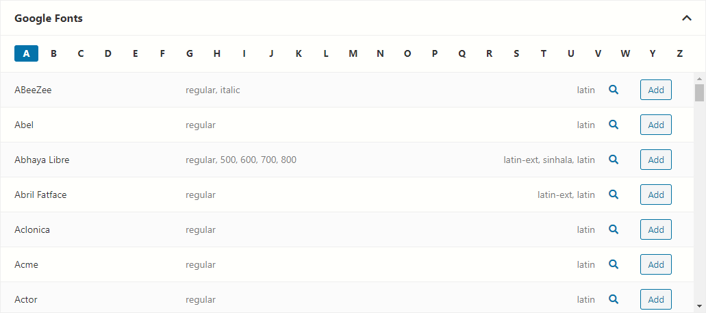
Google Fonts – Choose the font you need
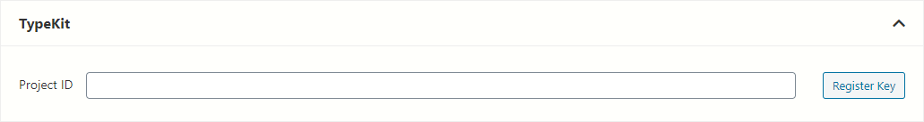
TypeKit – Set your TypeKit Project ID and press button “Register Key”
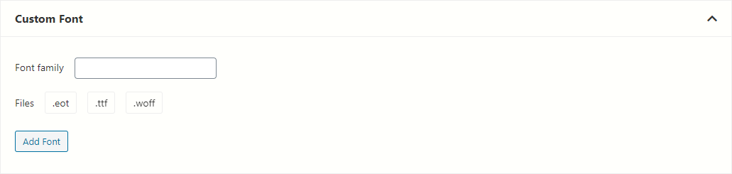
Custom Font – Set Font family name and select your font file
Icon Fonts
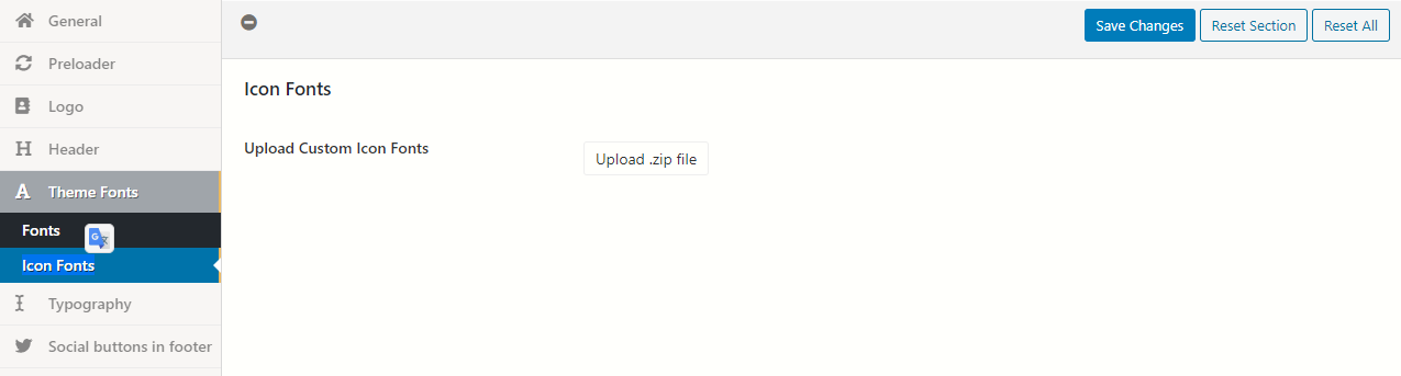
Upload zip-archive with icon font. You can create an icon font using IcoMoon
Typography #
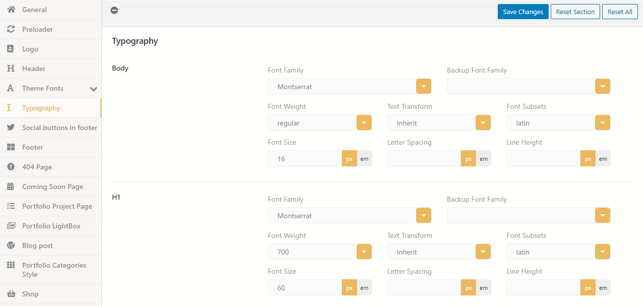
On this tab you can customize typogtaphy on the theme
Social buttons in footer #
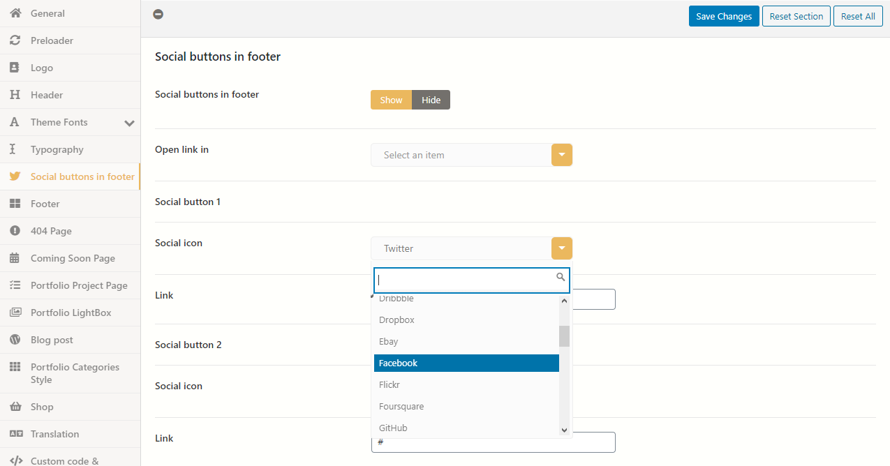
Select Social icon and set social link
Footer #
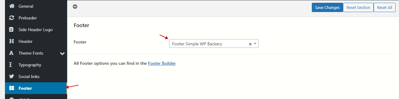
Footer – You can select footer
404 Page #
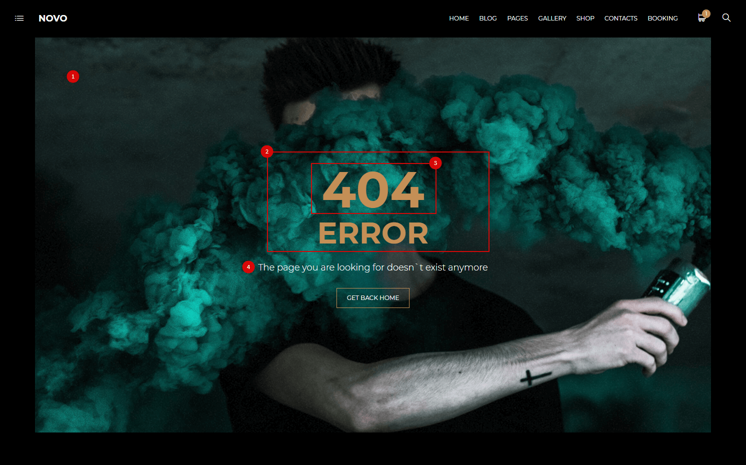
Background image – Set Background image for Page 404
Text color – Select text color (optional)
Heading color – Select heading color (optional)
Heading – Type heading. To wrap words on the next line, use <br/>. For enlarged part or all of the title(3), use <span></span>.
Example: <span>404</span><br>ERROR
Desc – Type page description
Coming Soon Page #
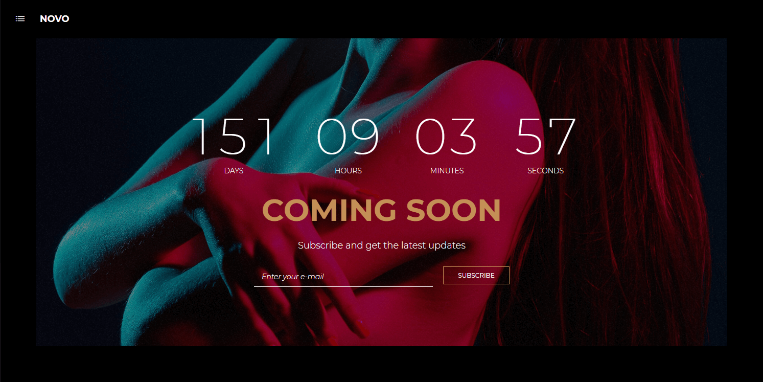
Background image – Set Background image for Coming Soon Page
Text color – Select text color (optional)
Heading color – Select heading color (optional)
Heading – Type heading
Desc – Type page description
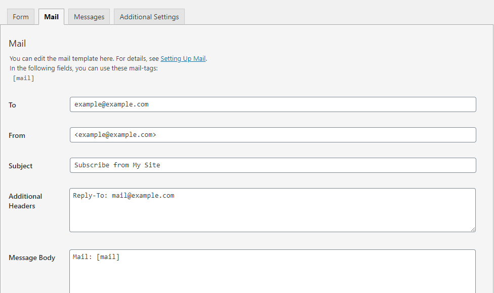
Subscribe form code – Shotcode you find “Admin Panel > Contacts > Contact Form” Shortcode col
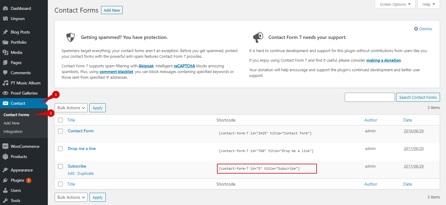
If you don’t have such a form, you need to create it.
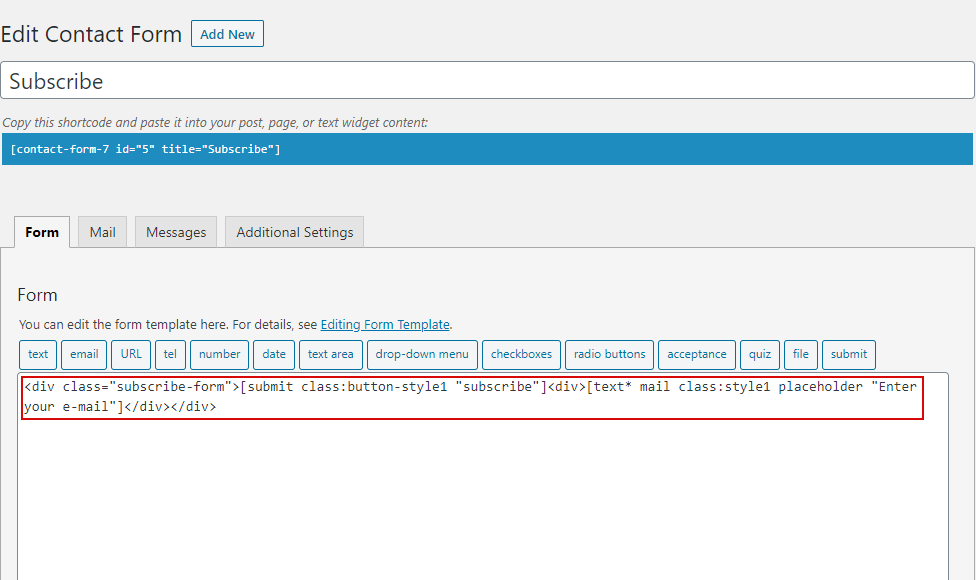
In form editor add code:
<div class="subscribe-form">[submit class:button-style1 "subscribe"]<div>[text* mail class:style1 placeholder "Enter your e-mail"]</div></div>
And cofigure sending mail in your mail address on tab “Mail”, Example:
Portfolio Project Page #
Style project page
If the gallery is empty it will use the standard style
Slider
Masonry
Grid
Horizontal
Horizontal Type 2
- Portfolio image
- Full – Image with original aspect ratio
- Adaptive – Image cover block
- Hide – Hidden image from page
- Show date – Show or Hide date under project title
- Show like – Show or Hide like
- Show navigation – Show or Hide navigation
- Link Back to Main Gallery – Type link on your gallery

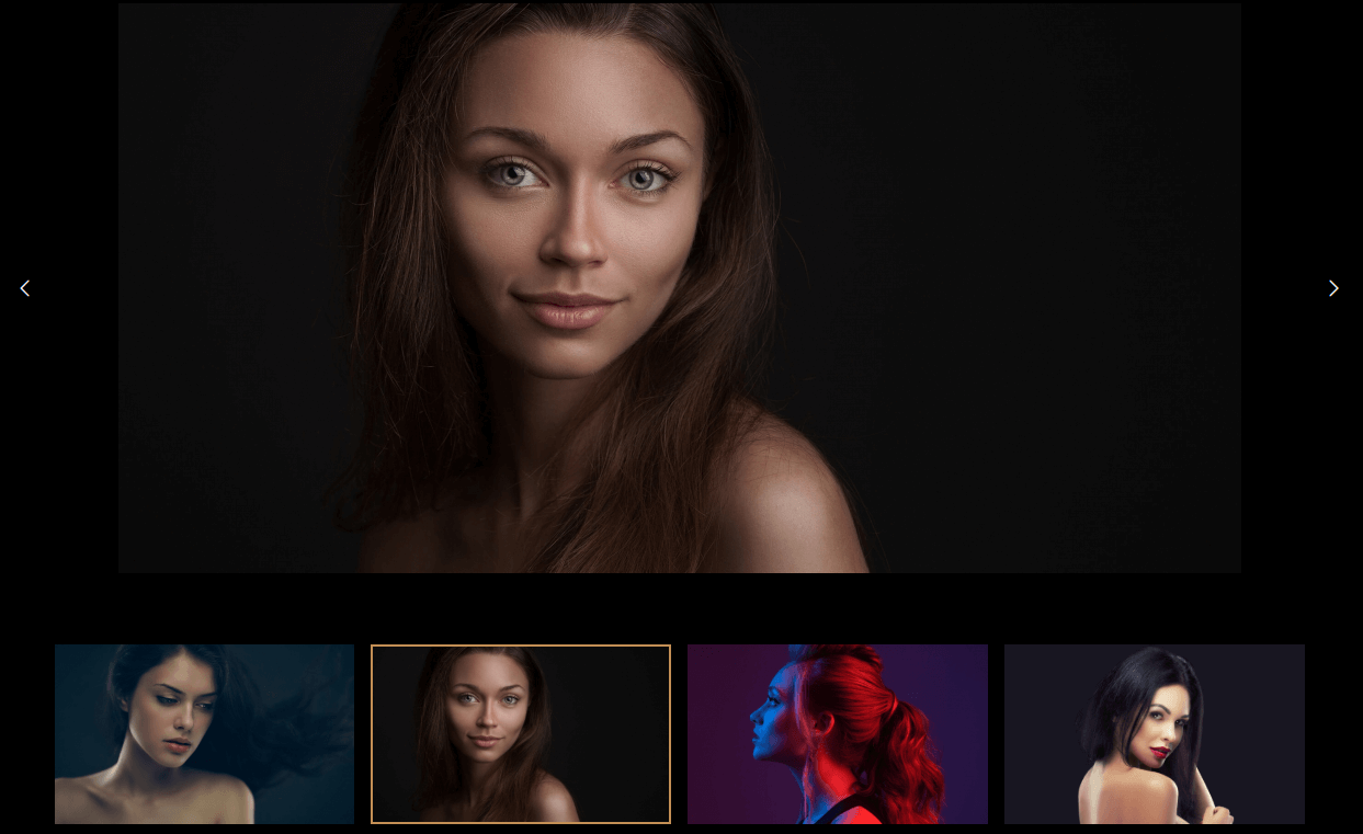
Portfolio LightBox #
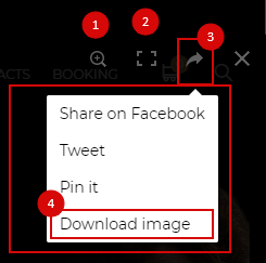
- Zoom – Show or Hide zoom button (№1)
- Toggle Full Screen – Show or Hide fullscreen button (№2)
- Share – Show or Hide share button and share block with all links (№3)
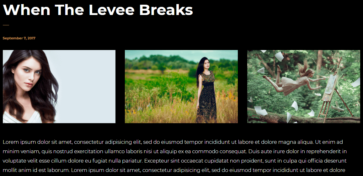
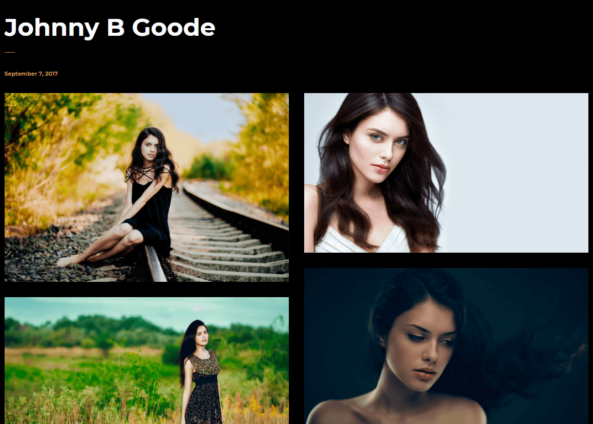
Blog Post #
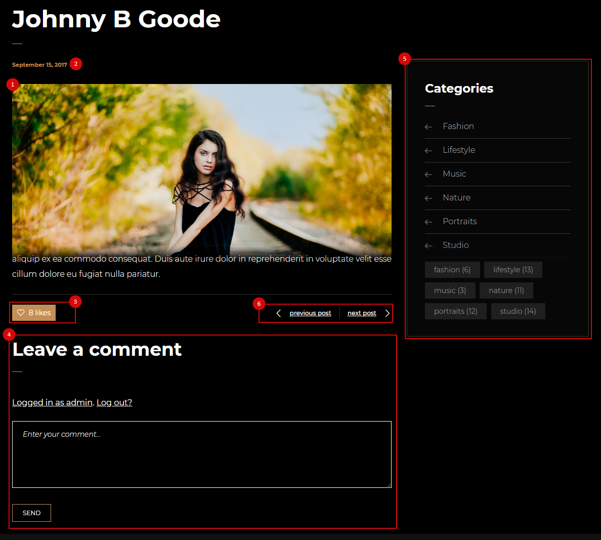
- Blog Feature Image – Show or Hide featured image (№1)
- Show Date – Show or Hide date (№2)
- Show Like – Show or Hide like button (№3)
- Show Comments – Show or Hide comments and comment form (№4)
- Sidebar – Show or Hide widget sidebar (№5)
- Show navigation – Show or Hide posts navigation (№6)
Portfolio Categories Style #
- Open project in popup
- yes – Project fetured image opened in popup
- no – Project open on new page
- Portfolio style – Select grid or masonry
- Cols count – Select cols count
Shop #
- Type – Select grid or masonry
Translation #
On this tab you can change some words without edit .pot file.
Custom code & analytics & Map API #
On this tab you can add js code in <head> and after </body> tag. It can be either analytics code or any other js code.
To receive Google Map API Key you need Create an application in Google Console and add the Key to input.